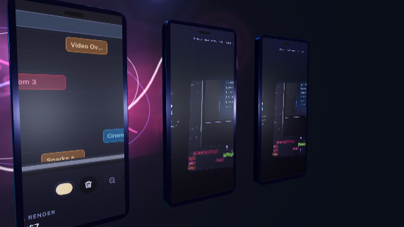
Dimension controls sound basic until you need to make the same product story work in three places: a vertical social placement, a wide landing page hero, and a tighter app-store frame. That is where canvas dimensions stop being a setting and start being part of the creative workflow.

Designing for the Destination
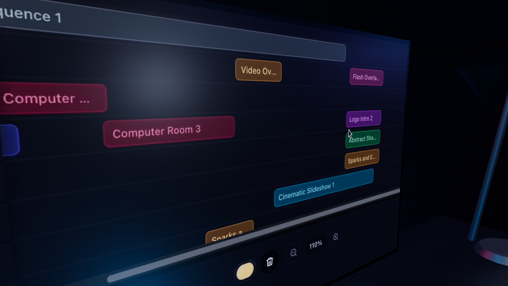
One of the easiest ways to make app videos feel awkward is to design in a generic frame and crop later. AppVideoStudio treats the canvas as part of the setup so the whole composition can respond to it.
- Portrait canvases can emphasize mobile flows and tighter callouts.
- Landscape canvases give more room for environments, labels, and comparative layouts.
- Template and component choices make more sense when the target frame is explicit.
Useful Even in Early Drafts
This feature page is intentionally lightweight, but the product value is already real. The earlier a team locks the intended frame, the less rework there is later when exporting or adapting the video for a new surface.